Andrei Lungu
Andrei Lungu

The Amazon retail platforms have many categories of products and services, spanned across multiple countries. Along with the many design styles every category uses, there are many annual and seasonal events running every year. These events also have many sets of designs and style guides. For each event and category, Amazon Marketers needed sets of banners to drive traffic across campaigns.
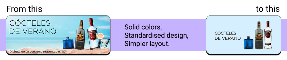
Over the years as the design trends shifted from the Skeumorphic look, so did banner design. To accomodate the increasing demand of banners art directors began shifting the designs to flatter styles, using more solid colors and simpler ilustrations. Teams realised that simpler banner designs could be generated on web applications, and if the designs are standardised, the manual production of banners could have been shifted to the automation tools and applications.
As time went on, different teams created their own solutions, but the scope was only limited to their own work, so each app - or tool as they were called - had many flaws. Our team had many projects, but we also handled first-hand the manual production processes.
And so, our team began working on a banner creation application which all marketers could use.
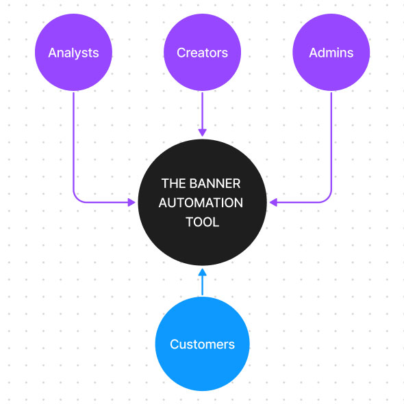
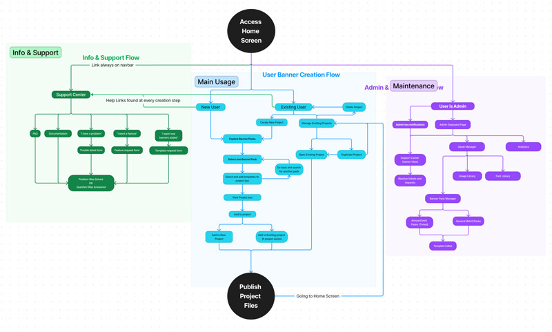
We identified which types of users would need to be accomodated by the tool.
As a team we were constantly communicating with site marketers and we had the chances to find trough our daily conversations what were their main objectives and challenges they were facing.
Among the many available applications for automatic banner creation, one was the most commonly used, as it was the standard manual graphic and creative request intake for our team and many others. It came with an automated banner workflow. Users who wanted to only automate banners encountered difficulties because the team was unable to make significant changes to the existing manual workflow, which was the basis for the automated one. Because the name sounded similar to "Flyroom," we'll call it that for the sake of privacy.
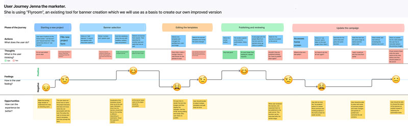
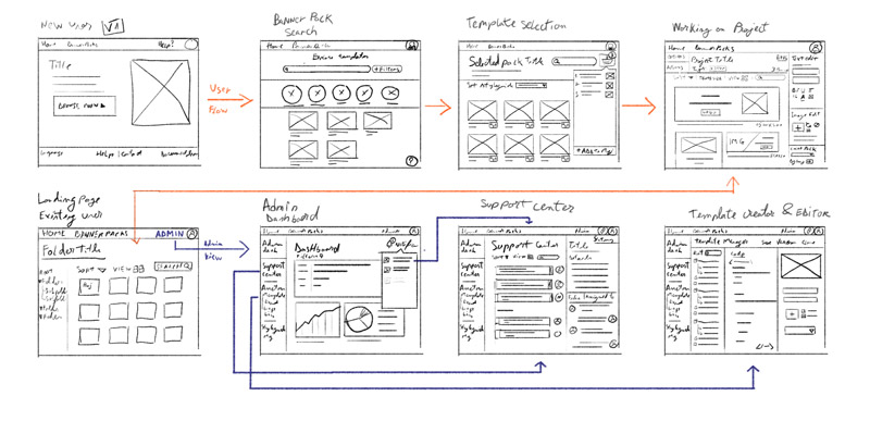
Based on the many screensharing calls we had while guiding marketers from manual to automated work, we built a regular user's or customer's journey through the automation workflow in Flyroom. The user interactions are summarized in the journey below.
We knew that in order to provide the best User Experience possible, we needed to cover all of the critical aspects of a Software as a Service application. Even if it was only for internal Amazon teams, we recognized that great UX leads to great efficiency, and efficiency eliminates the cost of lost time. And the time saved can be reinvested in more difficult projects. Simple onboarding and usage, scalability, and ease of maintenance were among the most important to us.
We considered the best way to integrate the workflows of all types of users, which are divided into "admin" and "customer" users. In this case, the customers required banners to be created, and the admin users created the environment in which the customers could complete their objectives. Admins included developers, analysts, project managers, template creators and styleguide creators.
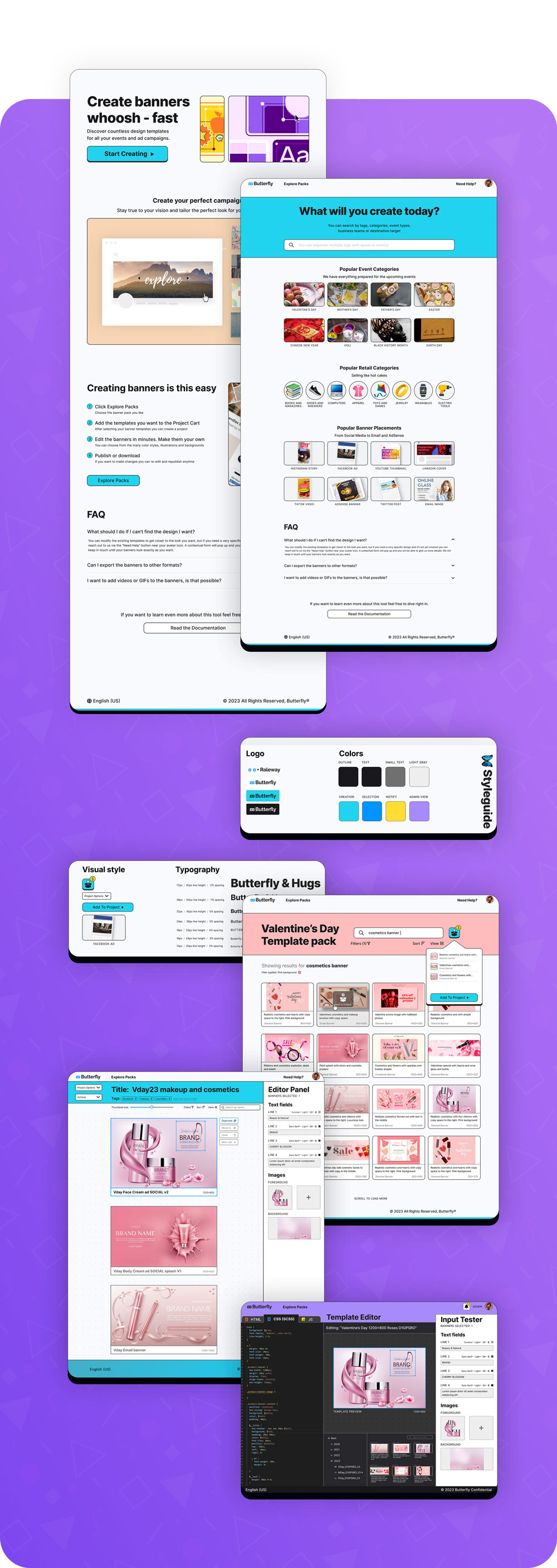
The "Creation" path for the customer is blue, while the path for the administrator is purple. This trend will be continued in the design styleguide. The support flow, which is an important component of any application, is color coded in green.
To safeguard the confidentiality of Amazon-owned applications, the designs presented from now on are personal and may differ from their counterpart. Having said that, they continue to adhere to the same principles, lessons learned, and improvements made.
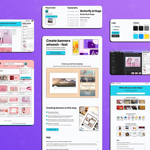
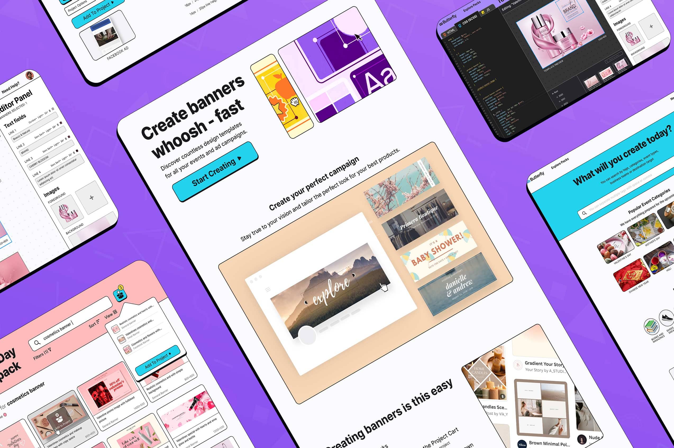
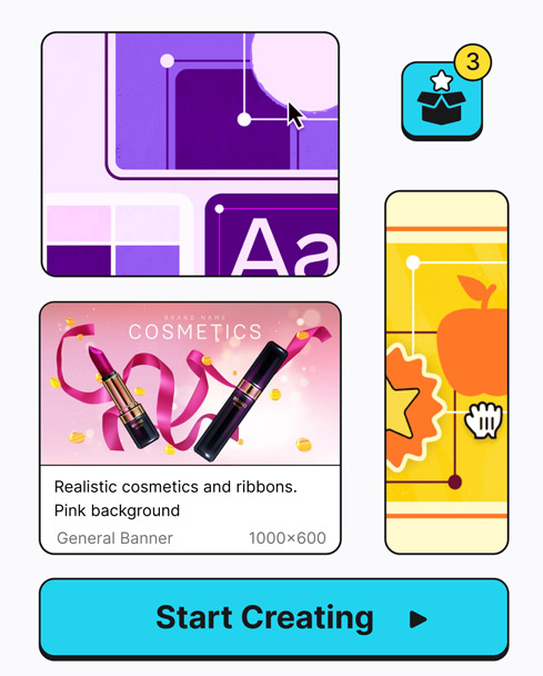
The application contains a large number of templates in various colors and shapes. It's critical to keep the UI from looking cluttered.
I went with a light neo brutalism design that featured a light background, rounded corners, and a thin gray outline.
Color and/or the drop shadow effect, which adds dimension, will make elements of interest stand out.
As a play on words, this application was created to be like "Flyroom" but better. Better-Flyroom ... Butterfly :)
The logotype is using the Raleway font family. I chose it particularly because I like the ligament in fl. The iconogrgaphy is made up of two characters from the International Phonetic Alphabet, brought closer together until resembling the likeness of a butterfly.
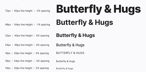
Inter is a variable font family that has been meticulously crafted and designed for computer screens. Inter has a tall x-height to improve the readability of mixed-case and lower-case text. Several OpenType features are also included, such as contextual alternates, which adjust punctuation based on the shape of surrounding glyphs, slashed zero for distinguishing "0" from "o," tabular numbers, and so on. The Inter project is led by Rasmus Andersson, a Swedish maker-of-software living in San Francisco.
The application uses a 12 column grid system, which allows all of the elements, regardless of their number, to fall into a visually pleasing grid. For the rows, I used an 8-point grid system to space everything out and create a vertical rhythm. The spacers were the base value X which was 16 points, 2x was 32 points 3x was 48 points and 4x was 64 points.
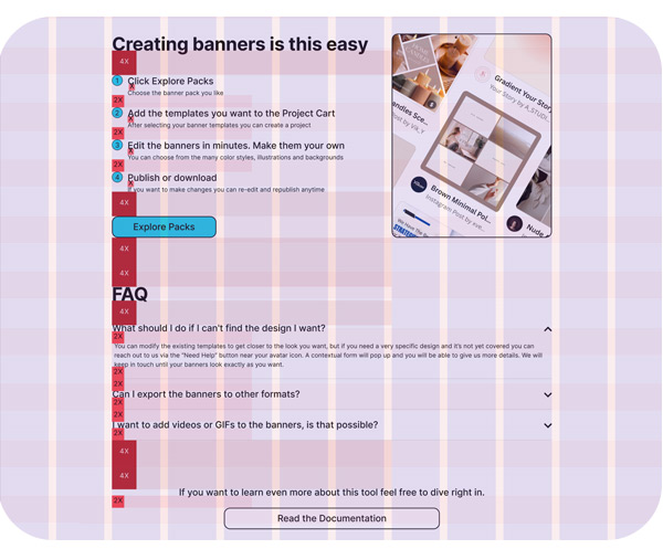
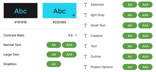
I paid special attention when developing all of the visual and text elements in order for the app to pass the WCAG 2.0 level of color contrast, which stipulates that normal text must have a contrast ratio of at least 4.5:1 and large text must have a contrast ratio of 3:1.
We've observed that if users don't have easy access to documentation and support, their frustrations will prevent them from using the application in the future. As such we planned from early stages to have a "Need help" button constantly available in the navigation bar, which takes the users to the support center where they can read frequently asked questions, the documentation and report issues or request templates. FAQ sections were also be placed in the landing pages for new users and in the banner pack selection window.

I'm from Iasi, Romania
I'm available for both local
or remote positions.
Check my LinkedIn for my resume.